Python Matplotlib - How to Create Histogram Plot in Python
In this post, we look at How to Create Histogram Plot in Python. Previously we looked at the Line Chart in Python using Matplotlib. That was pretty simple chart with enough simple data for you to plot easily on the canvas. You can use console and even the web based jupyter notebook for plotting this.
I assume you are making use of the notebook or even the console would work out. I think console option would only make the plot load quickly. I think if we can learn how to use either one of the option the result that we are about to get are going to be the same. So approach the plotting and the charts this way.
We are making use of the python, matplotlib and the visual studio code for the editing and the creating of the charts. If you have any other editor and the web based jupyter notebook option to use you can do so. It would be possible with the Googles Lab too. It would be possible for the
And I have created a video to give you an overview on How to Create Histogram Plot in Python. You should give this one a try.
Let's check the steps to write the code that can get the histogram plot. First thing we need to get the python if it is not already installed.
python --version
Now let's make use of the libraries that are required to draw the plot.
pip install numpy, jupyter matplotlib
Let's say we have an array of the people who are infected. And we want to make use of that array for drawing the histogram plot. So here we have that array.
[22,87,5,43,56,73,55,54,11,20,51,5,79,31,27]
Now we have to get this data and plot it as an histogram. So here's entire code below.
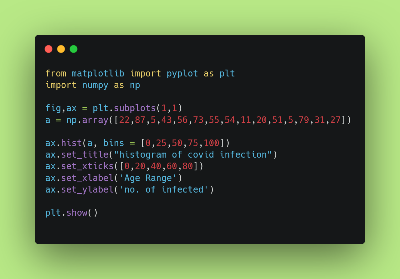
from matplotlib import pyplot as plt
import numpy as np
fig,ax = plt.subplots(1,1)
a = np.array([22,87,5,43,56,73,55,54,11,20,51,5,79,31,27])
ax.hist(a, bins = [0,25,50,75,100])
ax.set_title("histogram of covid infection")
ax.set_xticks([0,20,40,60,80])
ax.set_xlabel('Age Range')
ax.set_ylabel('no. of infected')
plt.show()
You can see this code in image format if you want clarity.
That's it. Now run your program under python and get the result in the window or the Jupyter notebook. So you should check it's output like below.
python example.py
It should produce output like below.
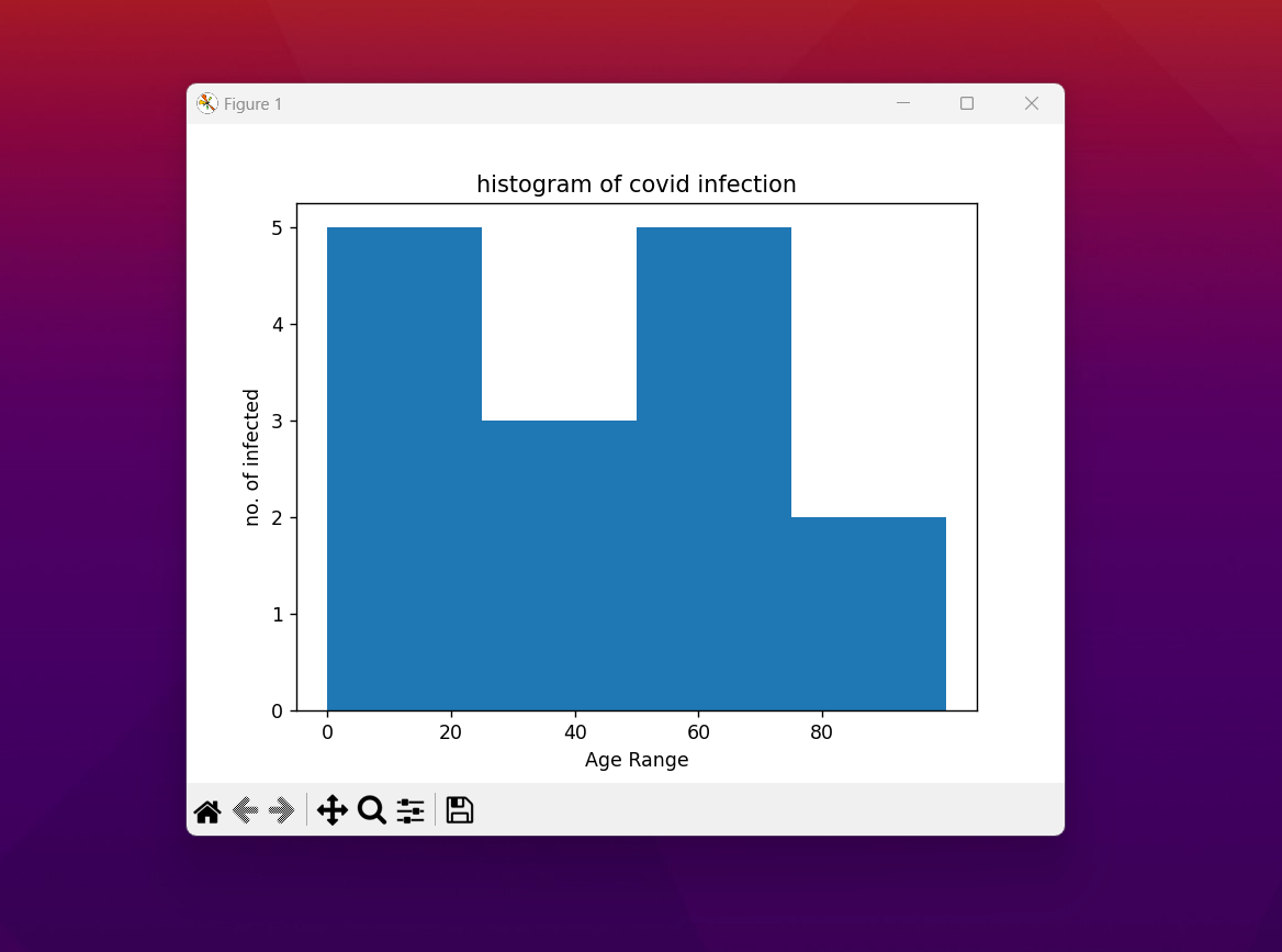
As you can see this may appear a bit close. However you can get the chart like the lines too. Like that would make it look like it's own waterfall yet the line based chart. It is a good chart that you should experiment with as well. I would also say you should experiment with the colors, and the dataset ofcourse. You are free to experiment from this point onwards.
This is one of the charts from the series of the charts and the plots that I am going to be covering. I have pretty good experience with these charts and things have helped out. Some of these charts I have yet to complete with other options but let's hope that the way things are going on, I'd be completing them and cover here on Hive too.
If you like my tutorials and also love to read some of the tutorials on the data science, power bi and the python, please do share and subscribe my videos. It would not only motivate me but also overall help me on the content side. Some of the really good tutorials are yet to be covered under the playlist and I would be making the videos on them soon. Your support on the channel is much appreciated.
If you happen to like this content, do give me feedback over there and that would help me improve my efforts in near future.
Thanks for your contribution to the STEMsocial community. Feel free to join us on discord to get to know the rest of us!
Please consider delegating to the @stemsocial account (85% of the curation rewards are returned).
You may also include @stemsocial as a beneficiary of the rewards of this post to get a stronger support.
Congratulations @devpress! You have completed the following achievement on the Hive blockchain And have been rewarded with New badge(s)
Your next target is to reach 50000 upvotes.
You can view your badges on your board and compare yourself to others in the Ranking
If you no longer want to receive notifications, reply to this comment with the word
STOPCheck out our last posts: