Python Matplotlib - How to Create Area Chart in Python
In this post, we look at How to Create Area Chart in Python. Previously we looked at Histogram Plot using Python Matlib. Histogram plot is pretty much effective with the population, large number based distributions and also few other type of the charts which can be useful for plotting the numbers. Hopefully people loved the tutorial.
I assume you are making use of the jupyter notebook and the python here for plotting the chart. It would be pretty useful for you to plot that.I would be giving the instructions on how you can install the jupyter and the python graphical libraries that would make it easier for you to plot. I would recommend you to plot the chart and then see if my result and your match or if you get any error etc.You can post about it in the comments.
I am currently using the visual studio code and the python compiler through the console in it as single place workspace to handle that. I would say that you can either choose terminal or the jupyter. Either one of that would be good enough for you to work with. You can easily use the google labs for this type of the code and the editing from within.I have found out to be working easily.
And I have created a video to give you an overview on How to Create Area Chart in Python. You should give this one a try.
Let's take a look at the code which would be easier for you to add libraries which would help draw the plot. Meanwhile you can check if you can use the python version check.
python --version
and then make sure to add some of the libraries. These include the jupyter, matplotlib and others etc.
pip install numpy, jupyter matplotlib
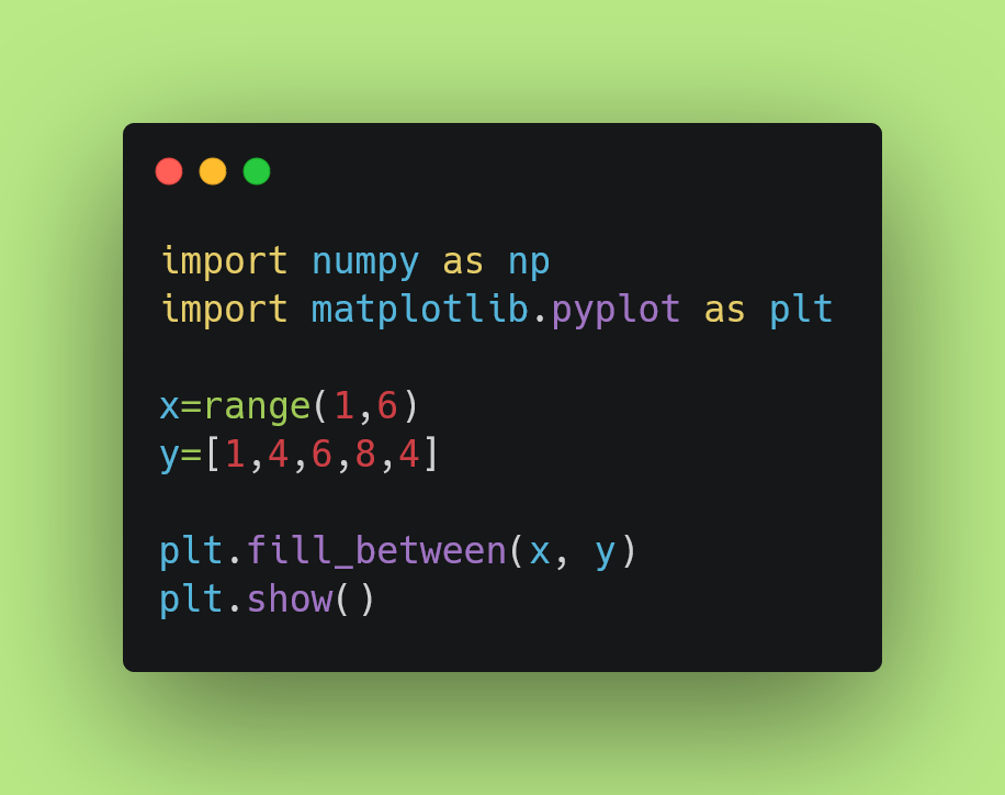
Now let's take a look at the data for you to check out, which would form our area chart.
x=range(1,6)
y=[1,4,6,8,4]
Here we are making use of the numpy to make use of the range function. Then we make use of the fill_between and then show() function. So the final code you can check out below.
import numpy as np
import matplotlib.pyplot as plt
x=range(1,6)
y=[1,4,6,8,4]
plt.fill_between(x, y)
plt.show()
I am also adding the code in the image form so that you can save it or have it in place where you can use it to refer later aswell.
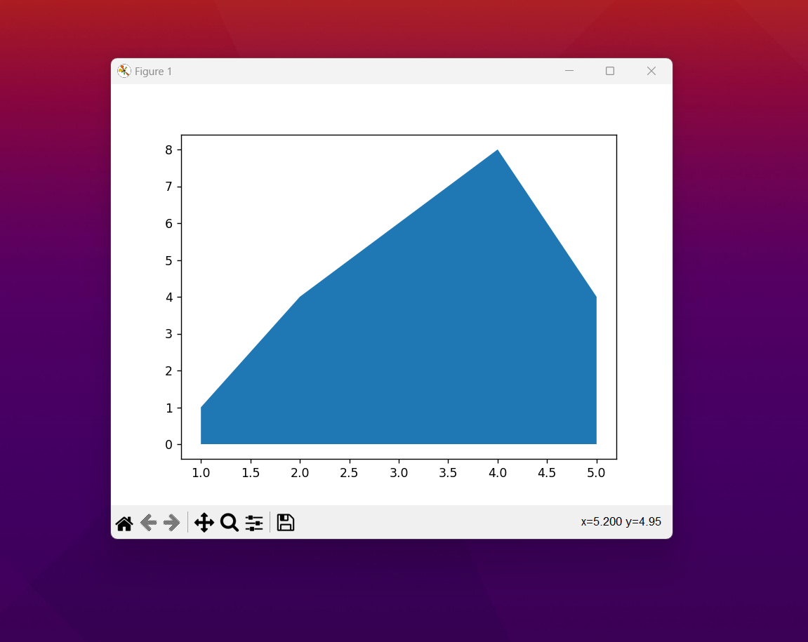
You can now check the plot below. This is the area plot. And you can also find the variation of the area chart depending on the data that you have and also the data that you want to make use of in terms of the viewing simple area to plot on as well.
That is it. You can now experiment with variety of the changes specific to the chart. Like say you want to change the orientation to horizontal and the vertical. and then you can also make sure to get the dots at the top of the lines. There would be variation of the area chart and the histogram that you can find out and learn more about and it all makes sense as you experiment.
Matplotlib has variety of the options and the configurations can be learned. You can improve your data and chart this way. If you manage to handle the library and it's usage things would be lot easier for you. I have yet to complete variety of the charts and it's simple usages but it may take a while to create some of the tutorials on them.I also think that depending on the context and the typical usage it would eventually be possible to cover some of these.
If you are reading these tutorials for some time now, I am sure you must be finding some value. I suggest you to check out the channel, then like and subscribe. If you can share the content in the telegram groups and the Whatsapp groups that would be super useful. Some of the use case scenarios for these tutorial would be for the academic and the office use. So if you have such groups and circle where this is discussed, then do share the content over there.
If you happen to like this content, do give me feedback over there and that would help me improve my efforts in near future.
Thanks for your contribution to the STEMsocial community. Feel free to join us on discord to get to know the rest of us!
Please consider delegating to the @stemsocial account (85% of the curation rewards are returned).
You may also include @stemsocial as a beneficiary of the rewards of this post to get a stronger support.
Congratulations @devpress! You have completed the following achievement on the Hive blockchain And have been rewarded with New badge(s)
You can view your badges on your board and compare yourself to others in the Ranking
If you no longer want to receive notifications, reply to this comment with the word
STOPCheck out our last posts: