Python Matplotlib - How to Create a Bar Plot in Python
In this post, we look at How to Create a Bar Plot in Python using Matplotlib. Previously I have covered the R related tutorials. And after churning them out for more than 6 months, I have decided to switch a bit for the python based tutorial. You can check the last tutorial video - Pair Plot in R here.
Now in order to draw these plots I assume you have the jupyter notebook. And inside which you have numpy, matplotlib and recent version of the python installed. This would be helping you with the plotting of variety of data plots using simple bar plot. So that's what we are going to cover in this tutorial.
I assume you know how Python works and I also assume you know how to use pip to install the following - jupyter, numpy, scipy, matplotlib etc. If you are done with installing these then you are ready to make use of the bar plot in python.
Let's take a look at the new curve function in this tutorial. And I have created a video to give you an overview on How to Create a Bar Plot in Python. You should give this one a try.
First thing we are going to be making sure that we have python installed.
python --version
Then next thing make sure to install jupyter, numpy and matplotlib
pip install numpy, jupyter matplotlib
Now that you have these packages installed, you can go ahead and make sure to try out the jupyter notebook by typing the below command.
jupyter
Now that you have jupyter notebook open, you can go ahead and type the below code into the editor and then you can run the same.
import matplotlib.pyplot as plt
fig = plt.figure()
ax = fig.add_axes([0,0,1,1])
name = ['A', 'B', 'C', 'D', 'E']
score = [23,17,35,29,12]
ax.bar(name,score)
plt.show()
Now we are going to run this code into the browser and let's see the output. This code should give you plot that looks something like this.
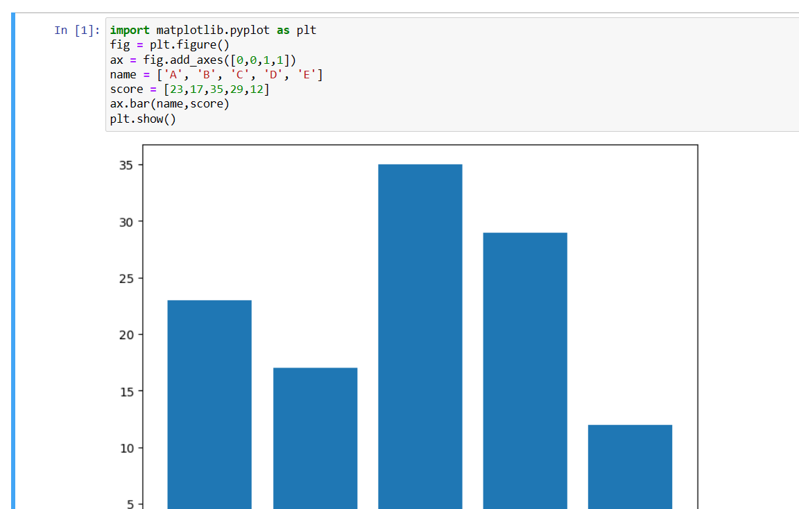
That's it. We have managed to draw our first plot in Python using matplotlib. Now we are going to make use of that plot to go ahead and draw some of the different data points. You can make use of your own custom data that you can use. And also you can edit for the variety of other things.
Say you want to change the color of the bars, that is possible. You can also make use of the vertical and horizontal bar changes.You would also be making use of the bars that would be small in size. You get to edit the changes for those bar plots. And if you handle the same properly it would be easier to manage as well.
You can check out my channel from the video above. Make sure to view the video and share it. That would help me a lot. As more views and the share would make things easier for the account to have some exposure in front of the algorithm. And that would also help rank the video and things would work around with the same.
If you happen to like this content, do give me feedback over there and that would help me improve my efforts in near future.
Thanks for your contribution to the STEMsocial community. Feel free to join us on discord to get to know the rest of us!
Please consider delegating to the @stemsocial account (85% of the curation rewards are returned).
You may also include @stemsocial as a beneficiary of the rewards of this post to get a stronger support.