My progress with Adobe Illustrator | Shaped text and 3D [EGN/SPA]
What's up community, my progress in Illustrator has gone from vectorization to learning the use of typographies in texts and phrases with a depth effect. The great thing about Illustrator and one of its most frequent uses is the possibility of editing words and letters at will, to the point of being able to create a completely personalized typography.
Mis progresos con Adobe Illustrator | Texto con forma y 3D
Que tal comunidad, mis avances en Illustrator han pasado de la vectorización a aprender el uso de las tipografías en textos y frases con un efecto de profundidad. Lo genial de Illustrator y uno de sus usos mas frecuentes es la posibilidad de editar las palabras y letras a nuestro antojo, al punto de poder crear una tipografía completamente personalizada.
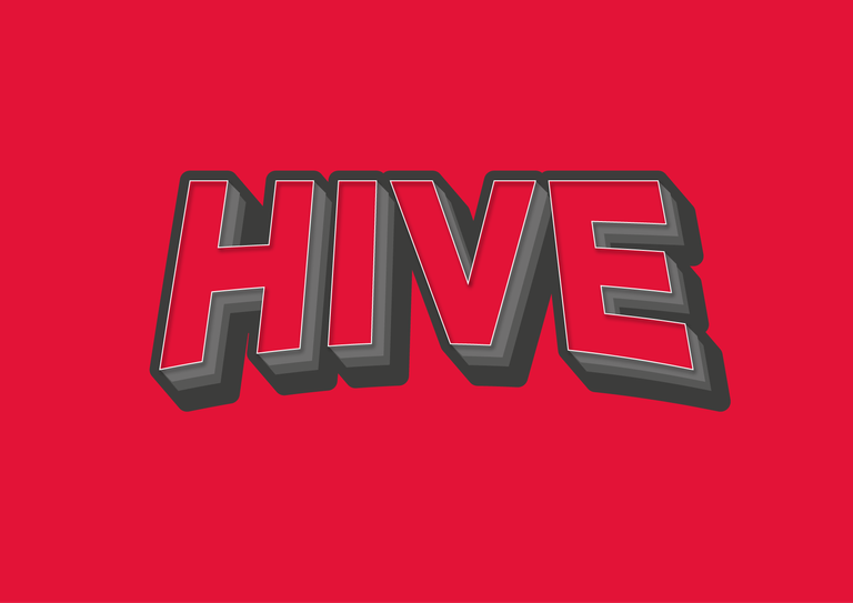
The image above this paragraph of the Hive logo, with words describing this blockchain inside is one of the effects that I have enjoyed doing recently, it looks simple but knowing the tools to achieve it is a challenge, as there are several ways to do it, so I started practicing with other figures like the ones you see below.
La imagen arriba de este párrafo del logo de Hive, con palabras que describen esta cadena de bloques en su interior es uno de los efectos que mas he disfrutado hacer recientemente, tiene una apariencia sencilla pero conocer las herramientas para lograrlo es todo un reto, ya que hay varias maneras de lograrlo, fue así como empecé a practicar con otras figuras como las que ven a continuación.

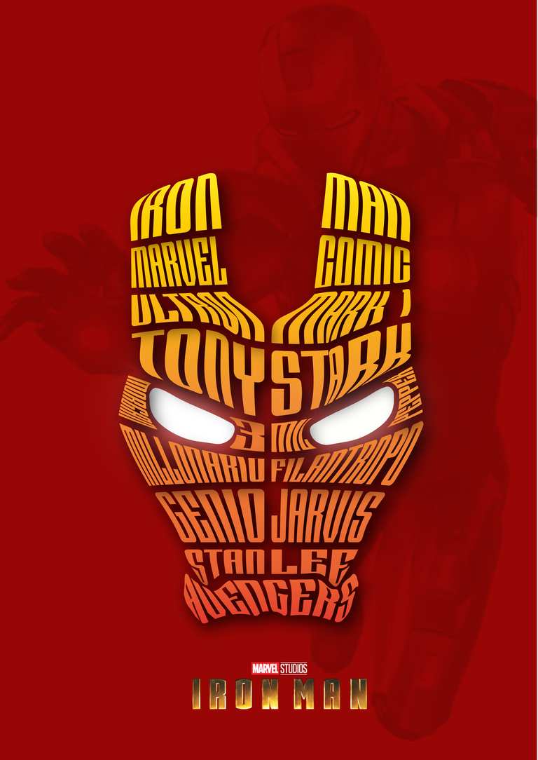

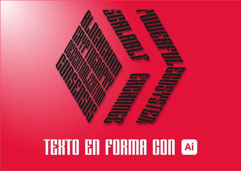
The challenge with these images is to make the text fit as well as possible in the shape you cut, in the case of Iron-man's face you must make a cutout mask with the divisions we want according to the amount of words we want to place. In the case of Spider-Man it is more complicated because there are already divisions, making the cut is simple with the image tracing tool, but being complex shapes to fit words is a long and painstaking process.
El desafío con estas imágenes es lograr que el texto encaje lo mejor posible en la forma que cortas, en el caso de la cara de Ironman se debe hacer una mascara de recorte con las divisiones que deseamos según la cantidad de palabras que deseamos colocar. En el caso de SpiderMan es mas complicado porque ya hay divisiones, hacer el corte en sencillo con la herramienta de calcar imagen, pero al ser formas complejas encajar palabras es un proceso largo y minucioso.
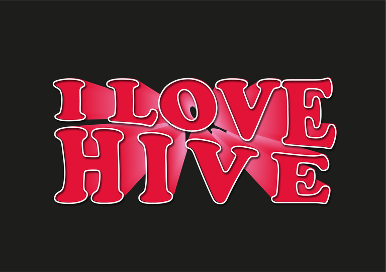
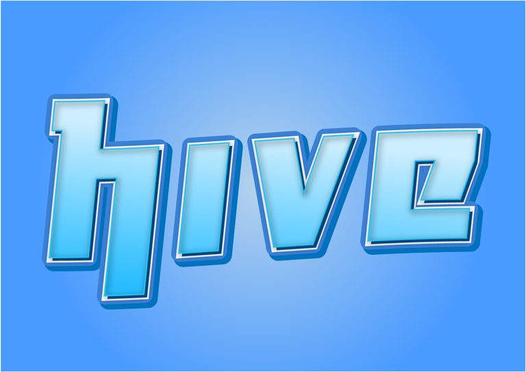
Layered words with depth or 3D effect are also an excellent motif to accompany flyers or edited images. As you can see in the two images above, one of the phrases has a distance depth effect which is achieved by placing the same phrase in the background and multiplying it as many times as necessary so that it looks like a kind of displacement. The second image is a series of layers of the same word in different sizes and colors, and the great thing about both is that they are editable, you can write what you want.
Las palabras en capas con efecto de profundidad o 3D también son un excelente motivo para acompañar flyers o imágenes editadas. Como observan en las dos imágenes superiores una de las frases tiene un efecto de profundidad a distancia el cual se logra colocando la misma frase al fondo y multiplicandola todas las veces que sea necesario a fin de que parezca una especie de desplazamiento. La segunda imagen si es una serie de capas de la misma palabra en distinto tamaños y colores, y lo genial de ambas es que son editables, puedes escribir lo que deseas.
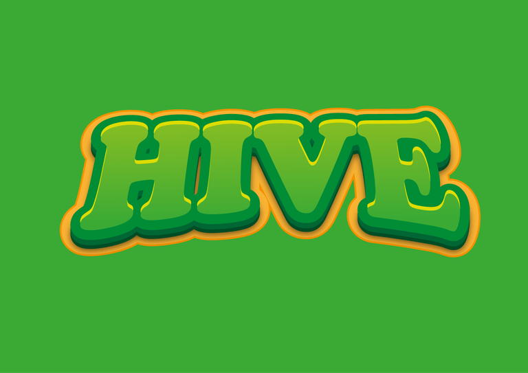
As you can see the typography can vary, with effects of arcs in the word, different colors and fonts, with some effects of parallel shadows and strokes on some edges. I hope you liked these simple designs, soon I will share with you how these creations are part of other more complex compositions that require much more detail and work.
Como podrán observar la tipografía puede varias, con efectos de arcos en la palabra, colores y tipos de letras distintos, con algunos efectos de sombra paralelas y trazos en algunos bordes. Espero que haya sido de su agrado estos sencillos diseños, pronto compartiré con ustedes como estas creaciones son parte de otras composiciones mas complejas que requieren mucho mas detalles y trabajo.
That's so cool! I used to learned all these back in the day but somehow stopped and relied a lot on Canva haha
Yeah that's the conversation I have with my instructor every day, tools like Canva and AI can do the work, what motivates me to continue is being able to do much more detailed work, for example, if you look closely at the images of the words , you will notice that there are layers on layers, one followed by another, that is details. The designer in the future will concentrate more on presenting all the details of a brand
Estupendas las imágenes!
Muchas gracias
Pues quedó bastante increíble brother sobre todo el de spider-man quedó brutal por cierto te quería preguntar cómo haces tú para exportarlos en una máxima calidad? Yo aún no logro dominar el proceso de exportación
Gracias @fabian98 aprecio la valoración. Mi pana al ser imágenes vectorizadas no pierden calidad, eso es lo bueno de crear con Illustrator, puedes aumentar o darle zoom a la imagen y nunca se verá pixelada a menos que la construyas con una imagen de internet no vectorizada. Cuando se exporta se hace con la calidad de 300pp
¿Tu usas Illustrator o te refieres a otro programa?