Some personal thoughts on the age of colour
In my recent work I usually apply intense and vibrant colors. I love to experience how those colors play with each other as well as our feelings and human emotions.
Lately I've become aware that I'm also being attracted to colors "of age". Be it colors that were popular in the past but also colors that changed because of their sheer age.
In this blog I will investigate and share with you some (thoughts) of these beautifully old vintage colors. At the same time, I can once again indulge in my "guilty pleasure" of reproducing old palettes and prints...
Old colors
Digital technology has made life so easy for painters. They are now able to create any desired color in any amount they wish. And those colors will remain forever exactly like they were conceived!
Some time ago, I was researching the color palet of the 1920's. Just about one century ago, but I noticed that all colors had already considerably changed away from their original conception.
This was about the first time that I noticed I loved those old colors. They had become less bright, maybe a bit yellowish by age. Digitally removing this color veil unlocked the original hues and sophisticated subtleties of the colour palette. It also made them look a lot more modern!
For me personally this caused a real strong historic sensation. The old colors drew me into the age of my grandparents - a lot of their legacy came from that era. The refreshed colors made me realize that this had certainly not been a dull, dry, grayish episode in history!
Historic pigments
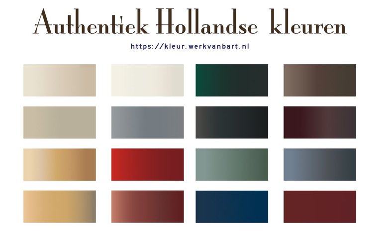
Colors already used before the 19th century are very natural & physical; they are made of dyes en pigments, which were originally made from raw minerals or natural resource material.
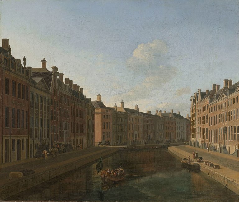
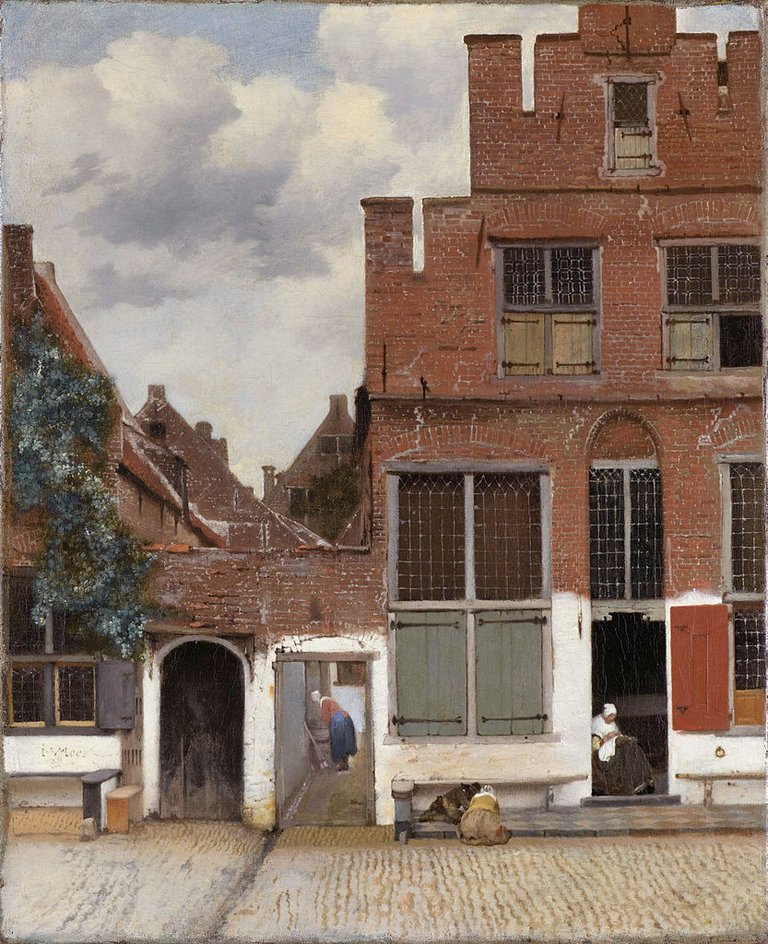
The availability of the natural resources and often determined the color palette of a particular region or culture. 17th and 18th century Holland used typical colors - some of them already imported from elsewhere. This historic Dutch colour palette defined the typical atmosphere of cities in the 17th and 18th centuries, as we know from the paintings of Vermeer and other masters.
The colours used then literally define for me the overall atmosphere of this period.
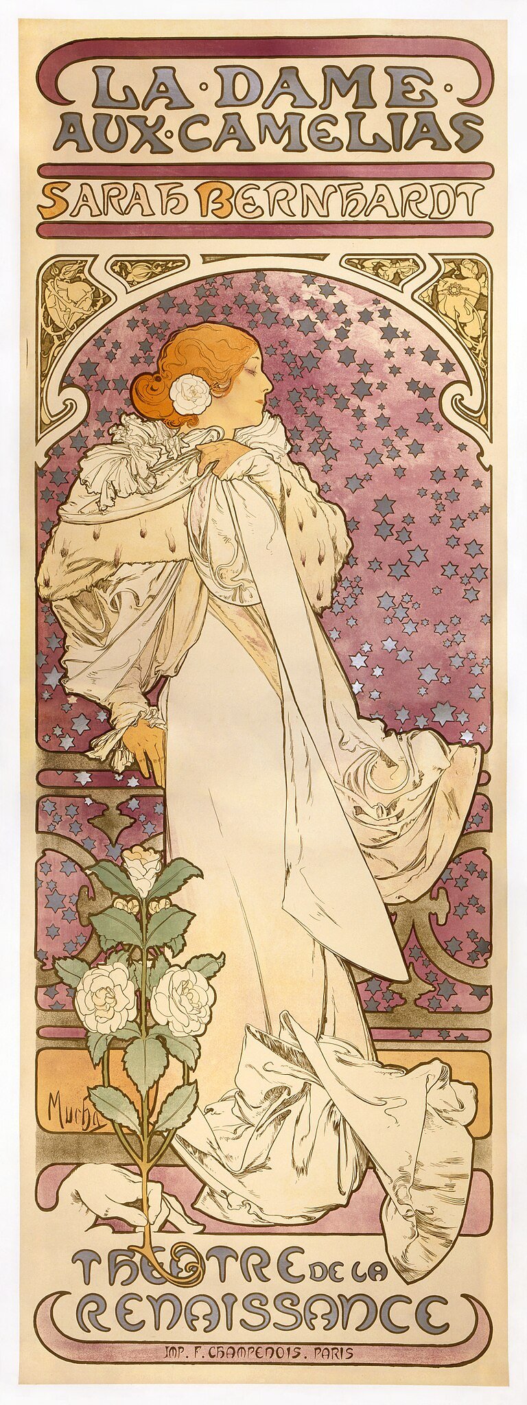
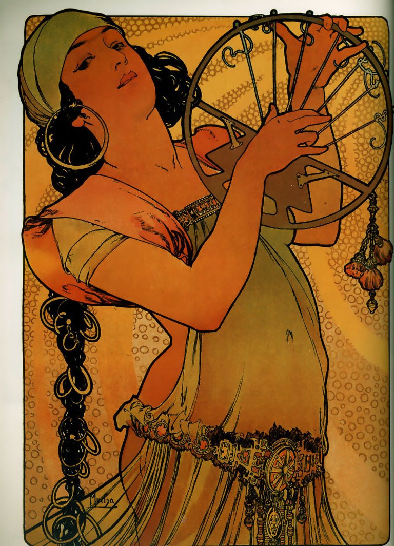
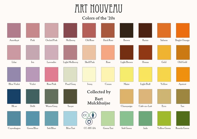
The Color Revolution
Since the advent of many more sythetic dyes in the 19th century, their use exploded. The availabity of a broader spectrum of colors led to abundance and often a wild end eclectic combinations of styles and colors. Rich jewel tones like emerald green, sapphire blue, and amethyst purple were often combined and and further accentuated with gold.
I haven't really researched this periode as yet. But since I recently moved to a typical 19th century house in France - including some of the eclectic furniture - this is definitely next on my list!
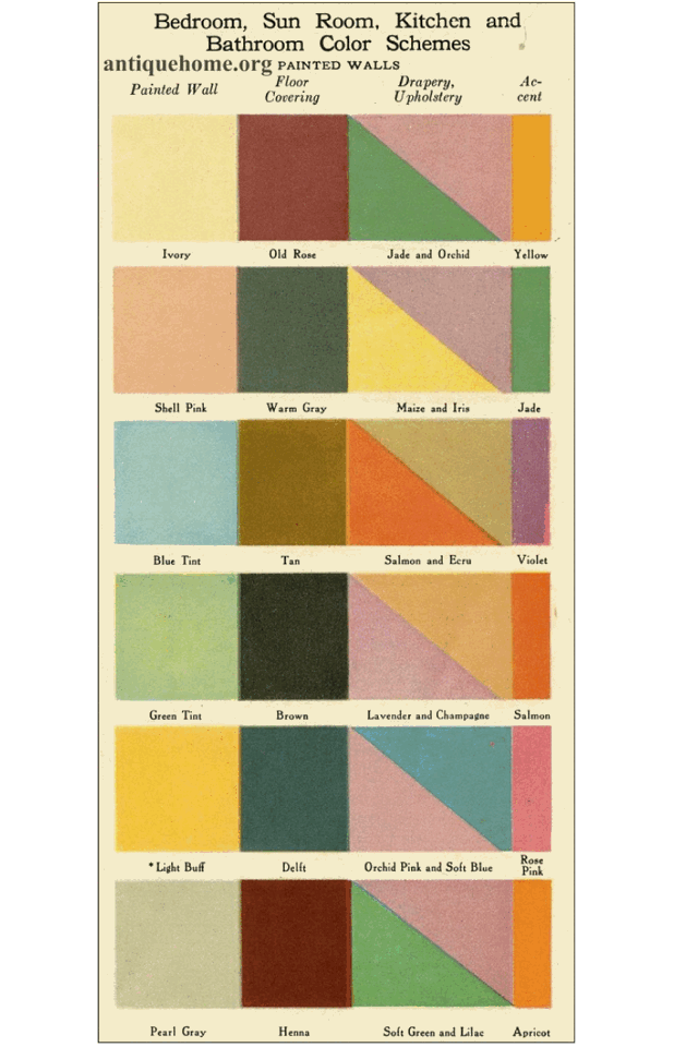
This explosion of colours eventually led to (scientific) reflection and the development of colour theory. The general taste moved to the preference of more restrained choices, with soft, organic hues like muted greens, earthy browns, and delicate pinks dominating the palette. Bright orange tints, blues and greens were used as accent coulors.
This colour palette perhaps even more strongly defines the zeitgeist of fashion, style and art. I personally cannot help but think of the Bell Epoque in Paris...
More recent old colours
I could go on and on; it seems that every period in history is also defined by it's colour palette. I'll give you a few links to read more about the colours of the 1970s. These colours will be vividly remembered by many - some older among us. And certainly the pastel colours of the 90s will also evoke fresh memories for many....
I am skipping this now because I also want to focus on natural science; the development of knowledge about what colours are, how we perceive them and can classify them.
Science - the Theory of Colour
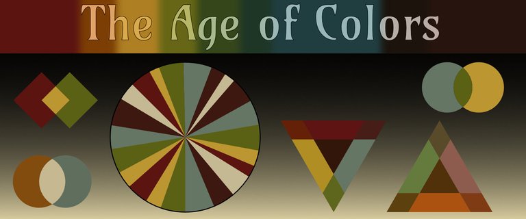
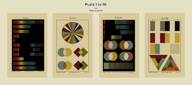
Recently I discovered an older scientific book from the beginning of the 20th cenury: "Colour, a handbook of the theory of colour", by Hurst, George Henry (1916).
What I like about these books is that they cover everything, from physical background, theorie of phenomena (mixing, contrasts) to the practical aspects of colour for decoration and design. But what I like most are the illustrations - there are twelve of them in the book and they're little works of art. Functional and aesthetic at the same time.
I can't help myself; just digitally reproducing these illustrations and safeguarding them for the future makes me happy. Below and in the banner on top of this blog article I shared a few of these plates with you.
Not enough ?? Read further...
Some links to articles I found interesting te read:
Congratulations @bartman67! You have completed the following achievement on the Hive blockchain And have been rewarded with New badge(s)
Your next target is to reach 90 posts.
You can view your badges on your board and compare yourself to others in the Ranking
If you no longer want to receive notifications, reply to this comment with the word
STOPCheck out our last posts: