JS DOM Animations & Tricks By albro
In this post I want to talk about animations in JavaScript. The discussion of animations in JavaScript is very complicated, but in this post you will get to know the main concepts and how DOM animations work in JavaScript.
What do you mean by DOM animations, you might ask? I mean, in the web world there are different ways to animate pages, but I want to look at a very simple and basic way to do this, which is done by manipulating the DOM.
Animation through the DOM
The best way to learn animations is by example, so let's first create a simple web page:
<!DOCTYPE html>
<html>
<body>
<h1>My First JavaScript Animation</h1>
<div id="animation">My animation will go here</div>
</body>
</html>
Now we need to define the space in which our animation will be done:
<div id ="container">
  <div id ="animate">My animation will go here</div>
</div>
In this code that is going to be added to our main page, I have placed two <div> elements in a nested form, but we know that divs are only containers for other elements and there's nothing inside them. So let's style these two elements. For the first div (the space where the animation takes place), I put position: relative; and for the second div (which will be the animation itself), I put position: absolute;. Then we add the rest of the styles according to our taste.
<!Doctype html>
<html>
<style>
#container {
  width: 400px;
  height: 400px;
  position: relative;
  background: yellow;
}
#animate {
  width: 50px;
  height: 50px;
  position: absolute;
  background: red;
}
</style>
<body>
<h2>My First JavaScript Animation</h2>
<div id="container">
<div id="animate"></div>
</div>
</body>
</html>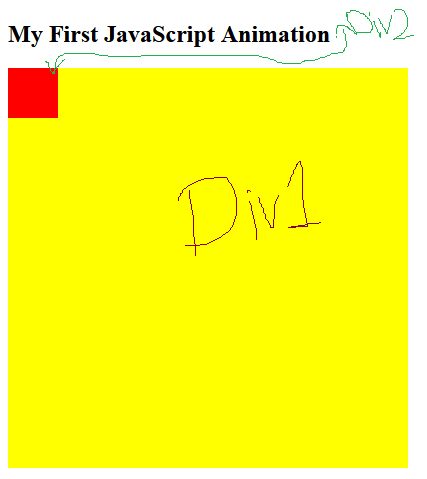
If you look at the output, you'll notice that I've turned the first div into a yellow square and placed the second div into a smaller, red square inside. Now I want to make the red square move inside the yellow square, which will be our animation. This is where JavaScript comes in:
function myMove() {
  var elem = document.getElementById("animate");
  var pos = 0;
  var id = setInterval(frame, 5);
  function frame() {
    if (pos == 350) {
      clearInterval(id);
    } else {
      pos++;
      elem.style.top = pos + 'px';
      elem.style.left = pos + 'px';
    }
  }
}
What do you think this JavaScript code that will be added to our main code later does?
As you can see, I have first defined a function and named it myMove (meaning my move). Then I have created a variable called elem (abbreviation of element). From its name, it is clear what I put in this variable:
var elem = document.getElementById("animate");
If I want to write a statement in JavaScript that takes an element from the DOM, I have to start with document because the main object is in my browser. Then I have used the getElementById statement, which works to get HTML elements based on their id; I have given it animate.
Then I have created another variable called pos (abbreviation of position) and I have set its value to zero for now. The third variable is called id, and using the setInterval function, I told it to execute the frame() function every 5 milliseconds.
Why have I used the frame function first and then defined it? How can a function be used before it is defined?
In many programming languages, such work is considered an error, but in JavaScript there is a topic called Hoisting. Hoisting makes this code correct.
In the frame() function, I have said that if pos == 350, that is, the horizontal and vertical position of the element reaches 350 pixels, clearInterval to stop moving forward. How do you think I got to 350? If you remember, the first div, which was the animation space, had a height and width of 400 pixels, and the second div had a height and width of 50 pixels. If I want the second div to stay in the first div and not leave it, I have to subtract 400 from 50, which is 350!
Then I have said that if pos == 350, add one unit to pos (pos++) and after that I have given the following statement:
elem.style.top = pos + 'px';
elem.style.left = pos + 'px';
These two statements actually change the element's CSS value. style.top means the code, go to CSS styles, set the distance from the top of this element equal to pos pixel! I have also done this for the distance from the left. On the other hand, I know that the frame() function is executed every 5 milliseconds by setInterval, which means that one unit is added to pos every 5 milliseconds, and naturally the distance from the top and left is added by one pixel. This continues until pos equals 350 pixels and then clearInterval is executed.
Now we see the final example:
<!DOCTYPE html>
<html>
<style>
#container {
  width: 400px;
  height: 400px;
  position: relative;
  background: yellow;
}
#animate {
  width: 50px;
  height: 50px;
  position: absolute;
  background-color: red;
}
</style>
<body>
<p><button onclick="myMove()">Click Me</button></p>
<div id ="container">
  <div id ="animate"></div>
</div>
<script>
function myMove() {
  var elem = document.getElementById("animate");
  var pos = 0;
  var id = setInterval(frame, 5);
  function frame() {
    if (pos == 350) {
      clearInterval(id);
    } else {
      pos++;
      elem.style.top = pos + "px";
      elem.style.left = pos + "px";
    }
  }
}
</script>
</body>
</html>
Loading animation with JavaScript
<!DOCTYPE html>
<html>
<style>
.preloader {
  height: 100%;
  width: 100%;
  background: #fff;
  position: fixed;
  left: 0;
  top: 0;
  z-index: 10000;
  perspective: 1600px;
  perspective-origin: 20% 50%;
  transition: 0.5s all;
  opacity: 1;
}
.spinner {
  width: 80px;
  height: 80px;
  border: 2px solid #f3f3f3;
  border-top: 3px solid #0088cf;
  border-radius: 100%;
  position: absolute;
  top: 0;
  bottom: 0;
  left: 0;
  right: 0;
  margin: auto;
  animation: spin 1s infinite linear;
}
.preloader.fade {
  opacity: 0;
}
.b-ico-preloader {
  background: url(http://weblaboratory.in.ua/wp-content/themes/graphy/images/new_logo.svg);
  background-size: cover;
  width: 52px;
  height: 67px;
  position: absolute;
  top: 0;
  bottom: 0;
  left: 0;
  right: 0;
  margin: auto;
  animation: ico 5s infinite linear;
  transform-style: preserve-3d;
}
@keyframes spin {
  from {
    transform: rotate(0deg);
  }
  to {
    transform: rotate(360deg);
  }
}
@keyframes ico {
  from {
    transform: rotateY(0deg);
  }
  to {
    transform: rotateY(360deg);
  }
}
</style>
<body>
<div id ="container"></div>
<script>
var preload = document.createElement('div');
preload.className = "preloader";
preload.innerHTML = '<div class="b-ico-preloader"></div><div class="spinner"></div>';
document.body.appendChild(preload);
</script>
</body>
</html>
Text animation with CSS only
<!DOCTYPE html>
<html>
<style>
@import url('https://fonts.googleapis.com/css?family=Roboto:700');
body {
  margin:0px;
  font-family:'Roboto';
  text-align:center;
}
#container {
  color:#999;
  text-transform: uppercase;
  font-size:36px;
  font-weight:bold;
  padding-top:200px;
  position:fixed;
  width:100%;
  bottom:45%;
  display:block;
}
#flip {
  height:50px;
  overflow:hidden;
}
#flip > div > div {
  color:#fff;
  padding:4px 12px;
  height:45px;
  margin-bottom:45px;
  display:inline-block;
}
#flip div:first-child {
  animation: show 5s linear infinite;
}
#flip div div {
  background:#42c58a;
}
#flip div:first-child div {
  background:#4ec7f3;
}
#flip div:last-child div {
  background:#DC143C;
}
@keyframes show {
  0% {margin-top:-270px;}
  5% {margin-top:-180px;}
  33% {margin-top:-180px;}
  38% {margin-top:-90px;}
  66% {margin-top:-90px;}
  71% {margin-top:0px;}
  99.99% {margin-top:0px;}
  100% {margin-top:-270px;}
}
p {
  position:fixed;
  width:100%;
  bottom:30px;
  font-size:12px;
  color:#999;
  margin-top:200px;
}
</style>
<body>
<div id=container>
  Albro
  <div id=flip>
    <div><div>Hive</div></div>
    <div><div>Blockchain</div></div>
    <div><div>Blog</div></div>
  </div>
  AweSoMe!
</div>
</body>
</html>
There are many ways to create animations on the web and I hope you enjoyed this post.
Nice post man! I was literally struggling the other day with something like this. If it had read this it would save me a couple of hours
Thanks for your contribution to the STEMsocial community. Feel free to join us on discord to get to know the rest of us!
Please consider delegating to the @stemsocial account (85% of the curation rewards are returned).
You may also include @stemsocial as a beneficiary of the rewards of this post to get a stronger support.
animation by programming is very useful. I'd like to learn it