Python Seaborn - How to Create Heatmap in Python
In this post we look at How to Create Heatmap in Python. Previously we looked at How to Create Count Plot in Python in Seaborn. That count plot was explained clearly in the last tutorial. If you want to check it out try the link in the earlier sentence. Now let's move onto the heatmap in Python.
Heatmaps are used in analytics, data analysis, time and population related data, and many other instances. This is something we have to learn to make use of for the simple building of the heatmaps. I have noticed that large amount of data across the scale can be easily measured and viewed through the heatmap. And a lot of data science people make use of it in most context visualizations.
What do you need for this? You need following libraries - pandas, seaborn, jupyter, numpy, matplotlib. And ofcourse all these libraries are for python. Make sure to have a recent version of the python and also have the version that has all recent libraries compatible. Make sure to setup the python environment on the desktop and also install all these libraries to try out the examples.
And I have created a video to give you an overview on How to Create Heatmap in Python. You should give this below video a look.
First thing we have to make sure to check python is installed or not. So we make use of the below command.
python --version
Now the next thing would be installing the following libraries that I explained earlier.
pip install numpy pandas jupyter seaborn matplotlib
Now let's get to the code. Let's make references to these libraries as first thing.
import pandas as pd
import numpy as np
import seaborn as sns
import matplotlib.pyplot as plt
Now next thing would be taking a look at the sample data for the plot.
df = pd.DataFrame(np.random.randn(50).reshape(10,5))
corr = df.corr()
Now let's try to plot the chart.
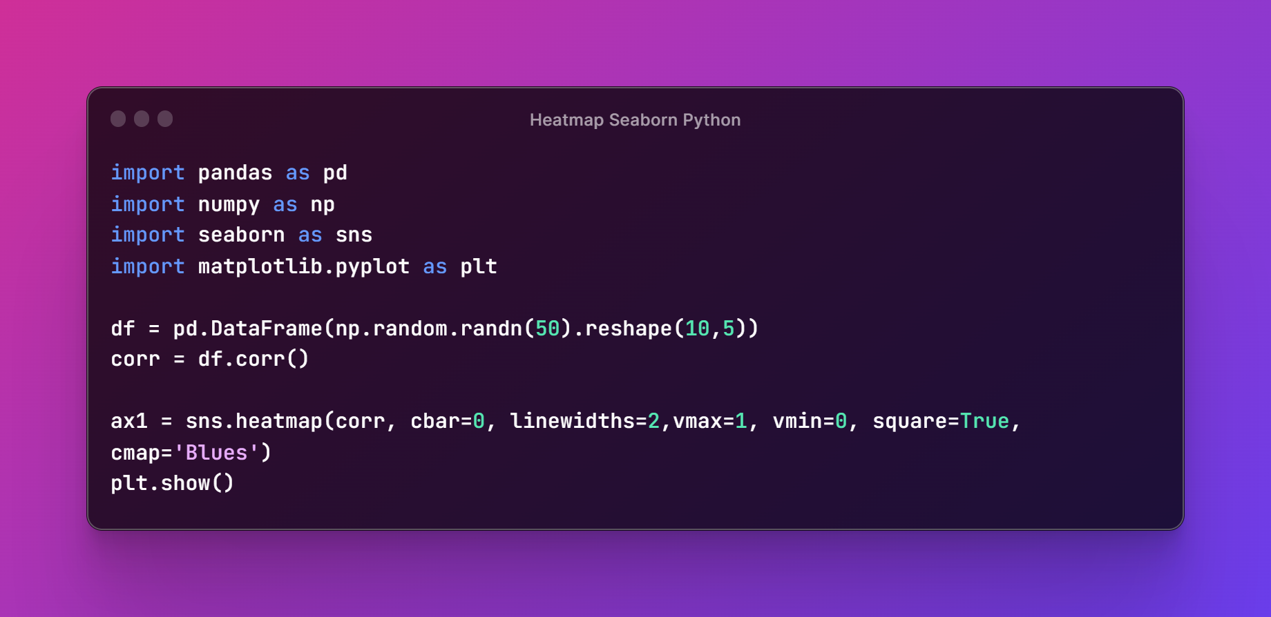
ax1 = sns.heatmap(corr, cbar=0, linewidths=2,vmax=1, vmin=0, square=True, cmap='Blues')
plt.show()
Now for those who want the reference for the code you can check out the below image.
Next thing would be making sure to execute the code explained above. And then run the python file in the terminal. This would help you with the code execution too. I assume you have code in example.py file so the below code should be run.
pytohn example.py
Thats it. Now check the below output.
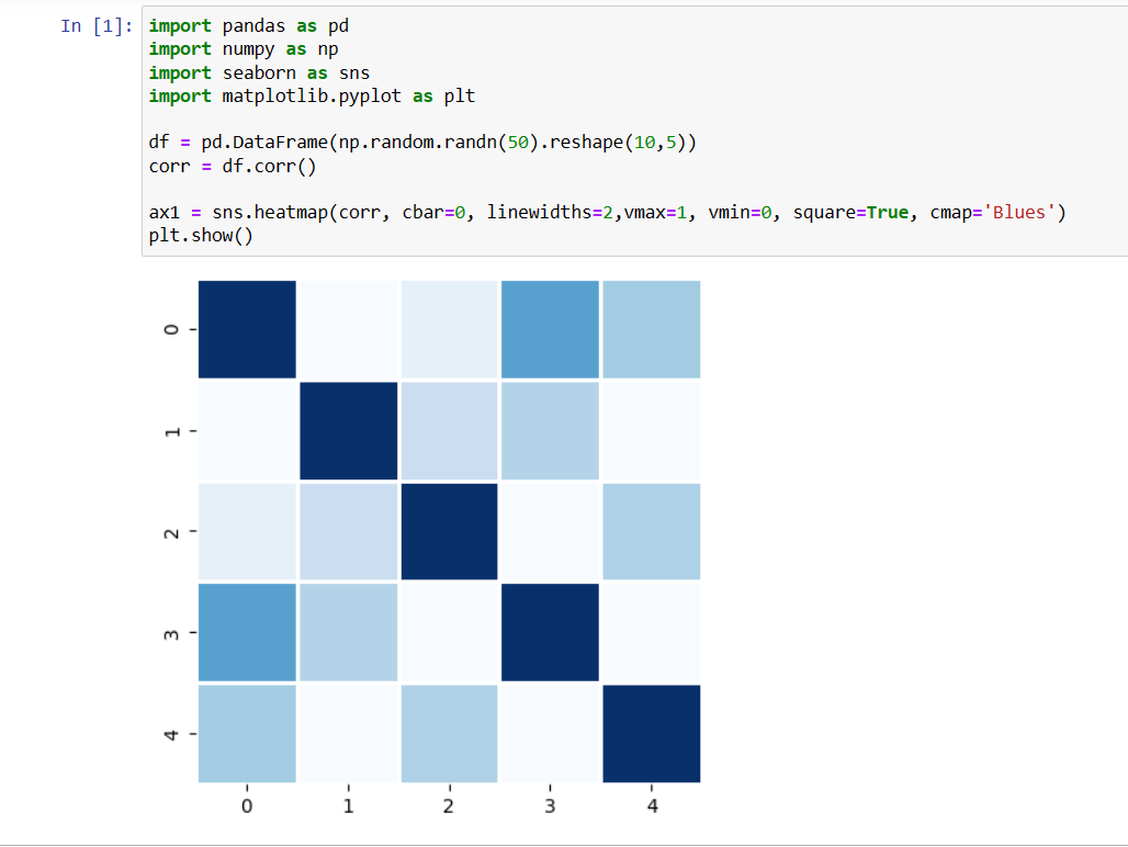
I hope that your output of the seaborn's heatmap was good. And you can ofcourse experiment with variety of the color themes. You should also change the data and not rely on the above example. You can get the content of variety of data that is out there on the web for the dataset. Some way that would make a good dataset output and it can produce a good visualization out of this example here. Experiment with the configurations of this function too. So you can see different output there.
This is one of the last series of the maps. And from the year 2024, I would be switching the attention to the oracle cloud and the azure cloud videos.Which I suppose would help both those who are into the devops and also those who have some experience with the content in the cloud and the code. I have posted playlist worth of the content on the Seaborn Python, Matplotlib and other python content. So hopefully you would enjoy that after subscribing, liking and sharing this content. Do check the channel on the video attached in the tutorial.
If you happen to like this content, do give me feedback over there and that would help me improve my efforts in near future.
Thanks for your contribution to the STEMsocial community. Feel free to join us on discord to get to know the rest of us!
Please consider delegating to the @stemsocial account (85% of the curation rewards are returned).
You may also include @stemsocial as a beneficiary of the rewards of this post to get a stronger support.
Congratulations @devpress! You have completed the following achievement on the Hive blockchain And have been rewarded with New badge(s)
You can view your badges on your board and compare yourself to others in the Ranking
If you no longer want to receive notifications, reply to this comment with the word
STOPCheck out our last posts: